Add a timescale in base r graphics
Timescales on figures are helpful
It is a good idea to add geological timescales to plots that show patterns over the Phanerozic. Timescales help the reader orient themselves with the new and interesting data that we want to show them. They can see more detail and with this orientation it is also easier for them to critically evaluate the pattern in the plot. Having a timescale on a plot is a win for the reader and it is a win for the author.
There are lots of ways to add a timescale to a figure. Some are minimal, with the timescale flowing along the bottom as an addendum to the \(x\)-axis that serves only to link an interval name to a time in millions of years. Other ways of adding a timescale take up more space in the figure. The timescale can flow behind the data making it easy to see when a pattern takes place. The most maximal approaches take the color scheme and all the subdivisions from the official timescale and add all of that information to the figure. This maximilist approach has a unique color for every stage. The rainbow of timescale colors duplicates in color the information that is contained in the space along the \(x\)-axis. For example, the timing of a data point at the end of the Cretaceous will be shown in the color of the timescale and in the position along the horizontal axis. A colored timescale also limits the choice we have of using colors to show different aspects of data without accedentially using a color that also indicates a specific time.
In any figure, the data is the most important aspect. We make a figure to show a pattern in the data. A timescale should add to the interpratability of the data and the pattern that we are showing. The timescale shouldn’t get in the way, obscure, or take prominance.
The features that I have found to be most affective in adding context to data without getting in the way are:
-
An un-filled ribbon with coarse-scale geological period or epoch names that run parallel to the \(x\)-axis.
-
A backdrop of alternating light-grey values that show intervals that are the same level as the ribbon or one step finer in resolution. It is important that the backdrop is much coaser than the scale that we plot the data.
I’ve fiddled with these details in the figures I’ve made and published. Over time, I’ve settled on a basic set starting rules for creating the backdrop and ribbon. I’ve life to start with a stage-level backdrop and a ribbon showing epochs when plotting data that is restricted to the Cenozoic or other single Period. If the figure shows a pattern that is Phanerozoic-scale or more, then the backdrop and the ribbon are no finer than period-level. In between these extremes, if my plot spans multiple periods, but less than the whole Phanerozoic, then my backdrop shows epochs and the ribbon shows the periods.
Sometimes the purpose of the figure itself suggests a different style of timescale. I want to make it easy to try all of these possabilities out and find the best solution for each figure. For this purpose, I’ve written some functions that add timescales to R plots. This makes it easy to add in and swap different timescales easily. I’ve made functions for base plots that are added to figures after the plot is defined but before the data are plotted.
The grey backdrop serves to make tone down the timescale and to highlight the data. But it is important to chose the level of greys and the difference between them carefully.Too much difference between alternating greys can make segments of a single color look different as it passes across the backdrop:
See how the blue line shifts color as it crosses from dark to light grey bars? This effect should be minimized as much as possible because it is addes noise to a figure. As our figures become more complicated, this noise will start to get in the way and make it difficult to read.
The greys are too disimilar in the plot above. If we keep the grey bars close in value we can mimimize the appearent color chnage of out data. So that the similarity helps to keep the colors we use to plot data easily comparable across time. Through experimentation I’ve settled on a set of greys that work well, at least as a starting point. The difference between grey90 and grey95 remain slight enough to minimize the apperent color changes as our data spans the timescale, but they are also visually distinct enough to keep the timescale legible.
If this backdrop is too light, the specific greys can be changed. But in my experience, an interval of 5 between greys works best. So as the backdrop can is darkerned keep the greys 5 units apart.
A basic time series
For these examples, I’ll plot time series of extinction rates. These examples are patterns of extinction for marine invertebrates over the Phanerozoic, including splits for physiologically buffered and unbuffered taxa (from Kiessling and Simpson 2011).
Here is a link to this time series data, a link to the timescale functions, and links to period and epoch interval ages.
ext <- read.csv("~/Dropbox/projects/Rmarkdown/timescales/ext.csv", header = T)

plot(ext$$Age.Ma, ext$$q, type = "l", xlim = c(550, 0), xlab = "Age (Ma)", ylab = "Extinction rate")
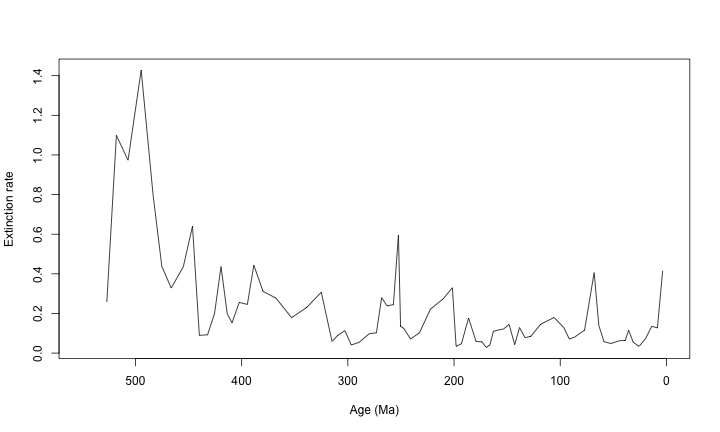
This is a bare-bones figure. With the functions below, we will add timescales to these basic figures.
Some functions and examples
First, let’s load a fucntion that draws a timescale with a ribbon and backdrop demarking the periods over the Phanerozoic.
tscales.period <- function(top, bot, s.bot, ...) {
    bases <- read.csv("~/Dropbox/projects/Rmarkdown//timescales/periods.csv",
        header = T)
    cc <- rep(c("grey95", "grey97 "), length(bases))

    rect(xleft = bases[-12, 2], ybottom = rep(bot, 11), xright = bases[-1, 2],
        ytop = rep(top, 11), col = cc, border = NA)

    rect(xleft = bases[-12, 2], ybottom = rep(bot, 11), xright = bases[-1, 2],
        ytop = rep(s.bot, 11), border = "grey90")

    bt <- (bot + s.bot)/2
    tpl <- bases[, 2] + c(diff(bases[, 2])/2, 0)

    text(x = tpl[-12], y = bt[-12], labels = bases[1:11, 1])
}
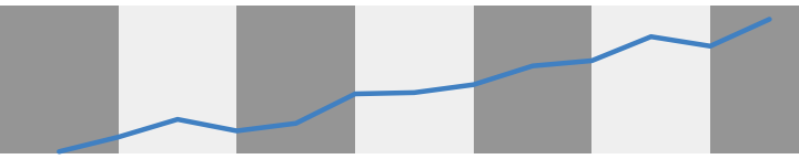
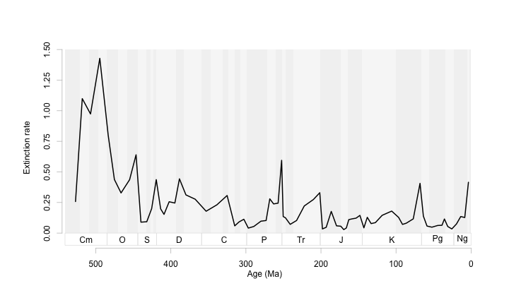
If we just append a plot command with this function you’ll get this:
plot(ext$$Age.Ma, ext$$q, type = "l", xlim = c(550, 0), xlab = "Age (Ma)", ylab = "Extinction rate")

tscales.period(1.4, 0, -0.1)
 Which is not very helpful.
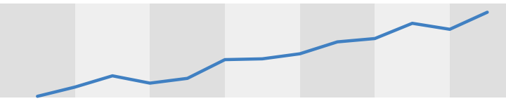
So, I like to define a plot region with some extra space for the ribbon and also without drawing anything. Then I add in:
- the timescale
- the data
- the axes and axis labels
plot(ext$$Age.Ma, ext$$q, type = 'n',
       xlim = c(550,0), ylim = c(-0.1, 1.5),
       axes = F, xlab = "", ylab = "")

tscales.period(1.5, 0, -0.1)

 lines(ext$$Age.Ma, ext$$q, lwd = 2)

axis(1, col = 'grey75', line = -0.5)
axis(2, col = 'grey75', line = -2, at = seq(0, 1.5, 0.25))

mtext("Age (Ma)", side = 1, line = 1.5)
mtext("Extinction rate", side = 2, line = 1)
It took a few tweeks of s.bot and the bottom limit of ylim to line things up right. I also like to adjust the axis position and specify the tick marks at this time. This figure is nice and clean, with the pattern highlighted and quietly supported by the timescale.
Now a timescale function with the backdrop showing epochs.
tscales.epoch <- function(top, bot, s.bot){
  labels <- read.csv("~/Dropbox/projects/Rmarkdown//timescales/periods.csv", header = T)
  bases <- as.vector(read.csv("~/Dropbox/projects/Rmarkdown/timescales/epochs.csv", header = T))
  end <- dim(bases)[1]
  cc <- rep(c("grey95","grey97 "),length(bases))

  rect(xleft = bases[-end,], ybottom = rep(bot, end), xright = bases[-1,],
       ytop = rep(top, end), col = cc, border=NA)

  rect(xleft = labels[-12, 2], ybottom = rep(bot,11), xright = labels[-1, 2],
       ytop = rep(s.bot, 11), border = 'grey90')

  bt <- (bot+s.bot)/2
  tpl <- labels[,2]+c(diff(labels[,2])/2,0)

  text(x=tpl[-12], y=bt[-12], labels = labels[1:11, 1])
}
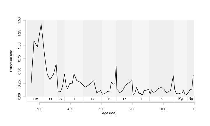
plot(ext$$Age.Ma, ext$$q, type = 'n',
       xlim = c(550,0), ylim = c(-0.1, 1.5),
       axes = F, xlab = "", ylab = "")

tscales.epoch(1.5, 0,  -0.1)

lines(ext$$Age.Ma, ext$$q, lwd = 2)

axis(1, col = 'grey75', line = -0.5)
axis(2, col = 'grey75', line = -2, at = seq(0, 1.5, 0.25))

mtext("Age (Ma)", side = 1, line = 1.5)
mtext("Extinction rate", side = 2, line = 1)
At this scale it is a bit noisy. So let’s zoom in on this time series, and make a few scaling adjustments to keep the ribbon just larger than the text.
plot(ext$$Age.Ma, ext$$q, type = 'n',
       xlim = c(250,0), ylim = c(-0.1, 0.7),
       axes = F, xlab = "", ylab = "")

tscales.epoch(0.7, 0, -0.05)

lines(ext$$Age.Ma, ext$$q, lwd = 2)

axis(1, col = 'grey75', line = -1.5)
axis(2, col = 'grey75', line = 1, at = seq(0, 0.5, 0.25))

mtext("Age (Ma)", side = 1, line = 1.0)
mtext("Extinction rate", side = 2, line = 3)
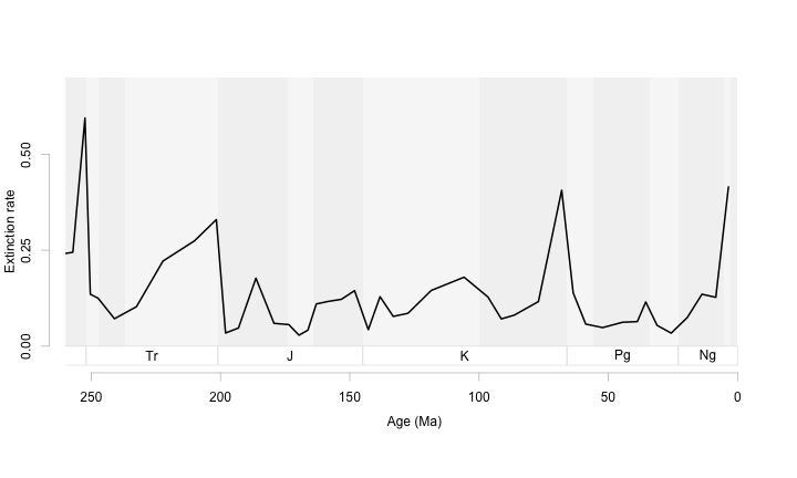 At this scale, an epoch-level backdrop works well. We can use it to orient ourselves within each period but it does not distract us from the patterns we want to show.
Even with two time series (both plotted in grey with labels), this backdrop does not get busy.
plot(ext$$Age.Ma, ext$$q, type = 'n',
       xlim = c(250,0), ylim = c(-0.1, 0.9),
       axes = F, xlab = "", ylab = "")

tscales.epoch( 0.9, 0, -0.05)

lines(ext$$Age.Ma, ext$$unb, lwd = 2, col = 'grey35')
lines(ext$$Age.Ma, ext$$ext.oth.b, lwd = 2, col = 'grey65')

axis(1, col = 'grey75', line = -1.5)
axis(2, col = 'grey75', line = 0.5, at = seq(0, 0.75, 0.25))

mtext("Age (Ma)", side = 1, line = 1.0)
mtext("Extinction rate", side = 2, line = 3)

text(235, 0.75, "Unbuffered", col = 'grey35')
text(85, 0.5, "Buffered", col = 'grey65')
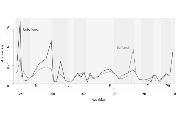
For this particular figure, I think it would help to change the aspect ratio so that the peaks in extinction are not so towering. This way we can see more clearly those times when boffered and unbuffered genera differ in their extinction rates. The goal with time series is to have an aspect ratio that tends to make the average slope at most 45 degrees.
par(tcl = -0.2, mgp = c(0,0.5,0))
plot(ext$$Age.Ma, ext$$q, type = 'n',
       xlim = c(250,0), ylim = c(-0.3, 0.85),
       axes = F, xlab = "", ylab = "")

tscales.epoch( 0.9, -0.05, -0.25)

lines(ext$$Age.Ma, ext$$unb, lwd = 2, col = 'grey35')
lines(ext$$Age.Ma, ext$$ext.oth.b, lwd = 2, col = 'grey65')

axis(1, col = 'grey75', line = -0.25)
axis(2, col = 'grey75', line = 0.5, at = seq(0, 0.8, 0.4), labels = c(0,0.4, 0.8))

mtext("Age (Ma)", side = 1, line = 1.0)
mtext("Extinction rate", side = 2, line = 2)

text(235, 0.75, "Unbuffered", col = 'grey35')
text(85, 0.5, "Buffered", col = 'grey65')
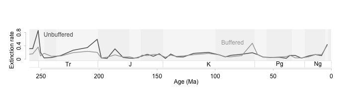
Shallow slopes on a time series will help us see patterns in the data more clearly (Cleveland, McGill, and McGill 1988; Tufte 2006; Talbot, Gerth, and Hanrahan 2012). In this example we can see that buffered and unbuffered genera diverge in extinction patterns during mass extincitons. When acidification is high, the unbuffered genera (those that can’t physiologically isolate themselves from the background ocean ph) suffer more extinction than buffered genera. Interestingly at the K-Pg extinction buffered genera have higher extinction rates. With the data plotted this way, we can see all the important events, see how they differ from each other and from the background, and see this all without relying on extra statistical information.
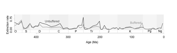
A wide and short figure even works for a longer time series.
par(tcl = -0.2, mgp = c(0,0.5,0))
plot(ext$$Age.Ma, ext$$q, type = 'n',
       xlim = c(450,0), ylim = c(-0.3, 1.0),
       axes = F, xlab = "", ylab = "")

tscales.period(1.5, 0, -0.2)

# lines(ext$$Age.Ma, ext$$q, lwd = 2)
lines(ext$$Age.Ma, ext$$unb, lwd = 2, col = 'grey35')
lines(ext$$Age.Ma, ext$$ext.oth.b, lwd = 2, col = 'grey65')

axis(1, col = 'grey75', line = -0.5)
axis(2, col = 'grey75', line = 0, at = seq(0, 1.5, 0.25))

mtext("Age (Ma)", side = 1, line = 1.5)
mtext("Extinction rate", side = 2, line = 1.5)
text(350, 0.6, "Unbuffered", col = 'grey35')
text(88, 0.5, "Buffered", col = 'grey65')
References
Cleveland, William S., Marylyn E. McGill and Robert McGill. (1988) The Shape Parameter of a Two-Variable Graph. Journal of the American Statistical Association 83(402):289-300.
Kiessling, Wolfgang, and Carl Simpson. “On the potential for ocean acidification to be a general cause of ancient reef crises.” Global Change Biology 17.1 (2011): 56-67.
Talbot, Justin, John Gerth, and Pat Hanrahan. (2012) An empirical model of slope ratio comparisons. Visualization and Computer Graphics, IEEE Transactions on 18.12: 2613-2620.
Tufte, Edward. (2006) Beautiful Evidence Graphics Press. New York.